
How to Create a High-Converting Landing Page for Your Coaching Business in 2026
Published on June 3, 2026 · Reading time: 5 min
You've put in the hours on social media. You share great content, chat with your followers, and have built a community that trusts you. But when it's time to sell your coaching program, does it feel like chaos?
If you're juggling DMs, trying to cram your entire offer into a tiny bio link, and manually tracking who has paid, you know what I'm talking about. It's messy, unprofessional, and honestly, it's exhausting.
This is the exact point where a coach landing page becomes your single most important asset. We're not talking about a complicated, multi-page website. This is one powerful, focused page that acts as the central hub for your entire coaching business. It's where you turn your followers into paying clients.
From Social Media Chaos to a Professional Coaching Business
Think of a landing page as the bridge between your social media audience and a real, structured business. It's where you graduate from being just a content creator to becoming a professional coach. A great landing page gives you:
- Clarity: It cuts through the noise of a busy social media feed and presents your offer without any distractions.
- Credibility: A dedicated, professional page shows you're serious, which builds immense trust with potential clients.
- Automation: It creates one single path for followers to understand what you offer, pay for it, and get access—all without you lifting a finger.
This simple diagram shows exactly what I mean—moving from the chaos of DMs to a streamlined system for getting clients.
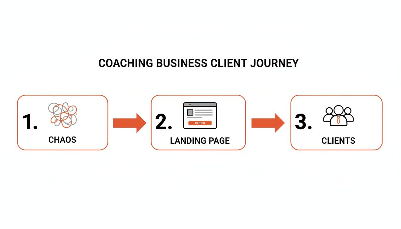
The landing page acts as the essential filter, turning scattered interest from your followers into a predictable flow of paying members.
Why Your "Link in Bio" Isn't Enough
Your social media profiles are fantastic for building an audience, but they are built on "rented land." Algorithms can change in a heartbeat, and your reach is never guaranteed. A landing page is an asset you own.
It's your digital storefront, open 24/7, ready to turn interest into income.
The goal isn't to replace your social media—it's to give your followers a clear destination. When someone asks, "How can I work with you?" you send them one link. That's it.
This single page is where you make your case. You explain the transformation you offer, showcase testimonials from happy clients, and answer common questions before they even have a chance to ask them. It's the difference between hoping people figure out how to pay you and giving them a professional, secure, and simple way to do it.
Taking this step solidifies your professional identity and sets you up for scalable, recurring income. For a deeper look at the business side, check out our guide on how to start an online coaching business.
The Essential Elements of a High-Converting Coach Landing Page
Ready to build your page? Let's break down the key sections that will turn visitors into clients.
1. A Headline That Promises a Transformation
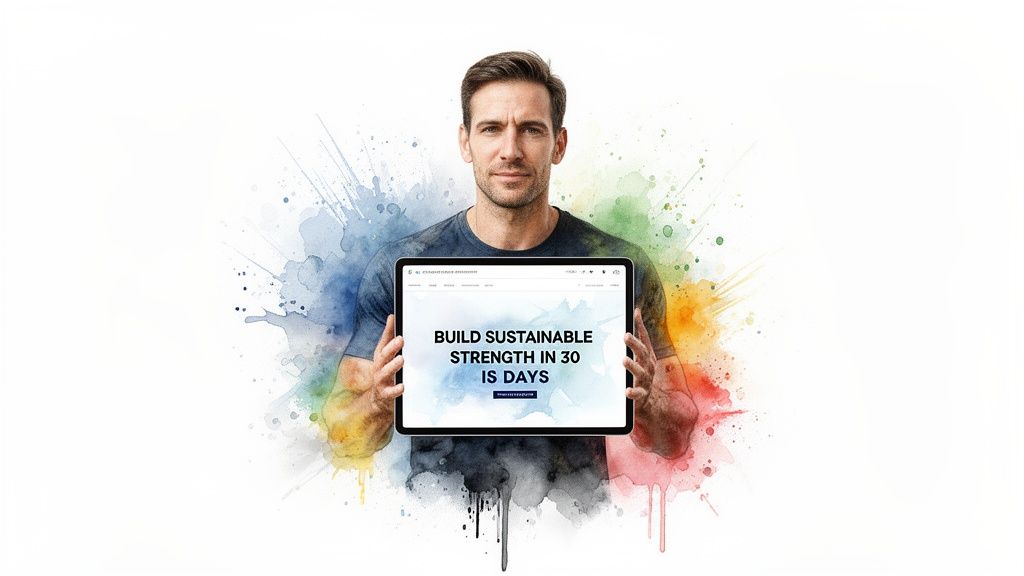
Your headline is the very first thing a visitor reads. You've got about three seconds to convince them they're in the right place. A weak headline sends them clicking away. A strong one makes them think, "Finally, someone who gets it."
The biggest mistake coaches make is writing vague, self-focused headlines like "Fitness Coaching" or "Wellness Services." They are forgettable because they describe your service, not your client's deepest desire.
Instead, your headline must promise a specific, desirable outcome. It must answer your client's silent question: "What's in this for me?" This is a core part of building your brand. If you want to go deeper, you can also explore these essential personal branding tips for coaches.
From Vague to Valuable: Headline Formulas
- Formula 1: [Achieve a Specific Result] in [Timeframe]
- Weak: Get in Shape
- Strong: Build Functional Strength and Drop a Dress Size in 6 Weeks
- Formula 2: [Get the Desired Outcome] Without [the Pain Point]
- Weak: Nutrition Coaching
- Strong: Learn to Fuel Your Body for Peak Performance Without Giving Up Foods You Love
A great headline acts like a filter. It repels people who aren't a good fit and magnetically attracts your perfect client. The goal isn't to appeal to everyone; it's to resonate deeply with the right ones.
2. An Image or Video That Tells a Story
Right below your headline, you need a "hero" image or video. This visual must do more than look nice—it needs to spark an emotion and reflect the transformation you're selling.
Please, avoid generic stock photos. Your followers connect with you.
- For Fitness Coaches: Instead of a photo of a model, show a real client (with permission!) smiling after a workout. Or, use a shot of you demonstrating a key movement in a welcoming way.
- For Wellness Teachers: A calm, serene photo of you in a natural setting can work wonders. It should communicate the feeling of peace and balance your clients are searching for.
- For Sports Trainers: A dynamic action shot of you coaching an athlete can instantly convey energy and expertise.
Your hero section—the one-two punch of your headline, a short subheading, and your image—sets the entire tone for your page.
3. Clear Sections Explaining Your Offer (Benefits, Not Features)
Your headline grabbed their attention. Now, show them exactly what you're offering and what it will do for them. The mistake most coaches make is listing features like "Weekly PDFs" or "WhatsApp Group." Those are flat and don't spark desire.
Your potential clients aren't buying stuff; they're buying a transformation. You must connect every feature to a tangible benefit.
How to Translate Features Into Benefits
Ask yourself the "so what?" question for every feature you list.
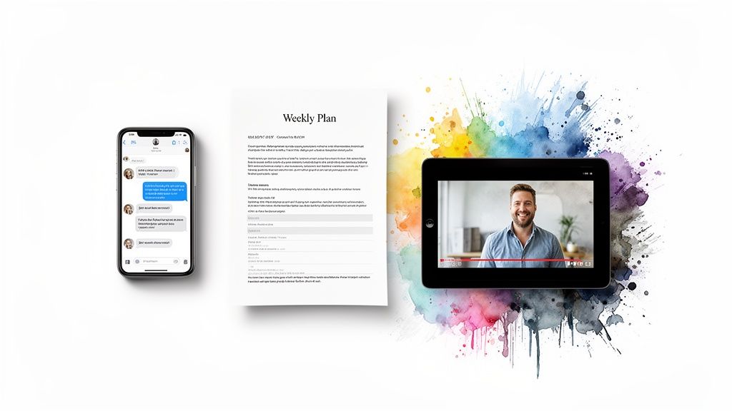
- The Feature: Access to a WhatsApp or Discord community.
- The Benefit: "Join a private, supportive network of peers who get it. You'll get daily motivation and accountability so you never feel like you're on this journey alone."
- The Feature: Weekly workout PDFs.
- The Benefit: "Get a new, easy-to-follow workout plan every Monday. Each routine is designed to be done in under 45 minutes, helping you build strength consistently without spending hours in the gym."
- The Feature: A library of on-demand training videos or downloadable resources.
- The Benefit: "Get instant access to our entire video library to master your form on your own schedule. Perfect your movements and avoid injury with expert guidance you can watch anytime, anywhere."
People don't buy drills; they buy the holes the drills make. Your clients aren't paying for PDFs and videos. They're paying for the confidence, strength, and community those resources help them build.
Use icons and bold text to make your list of benefits scannable and easy to understand.
4. Social Proof to Build Unshakeable Trust
You've spelled out the transformation. Now you have to face the biggest conversion killer: skepticism. Every visitor is thinking, "This sounds great, but does it actually work?"
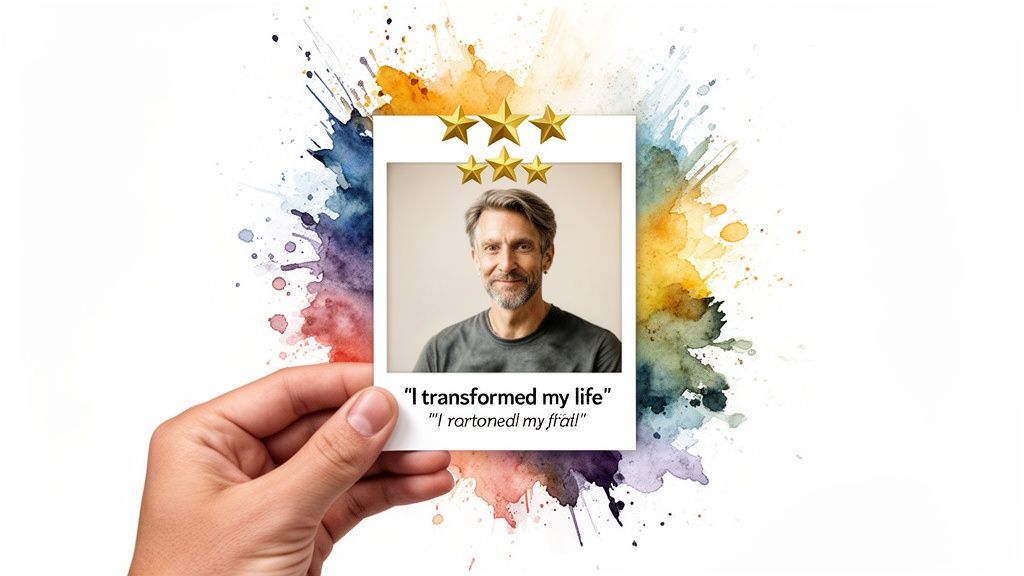
This is where social proof comes in. It's your evidence. The best testimonials are mini-stories of transformation. They highlight where a client was stuck, the journey they took with you, and the specific outcome they achieved.
Always include a name and a headshot of the client (with their permission). It makes a testimonial 10x more believable than an anonymous quote. You can even embed screenshots of positive comments from social media or your community chats. Also, add links to your social media profiles to reinforce your credibility and show your active presence.
5. An FAQ to Remove Last-Minute Doubts
One of the most underrated sections is a strategic FAQ. This is your chance to get inside your ideal client's head, anticipate their biggest anxieties, and answer them head-on.
Think about the questions that slide into your DMs all the time:
- "Is this program right for a complete beginner?"
- "What if I don't have a lot of time to commit each week?"
- "What if I need to cancel my subscription?"
By answering these questions directly on your page, you eliminate friction and prove that you understand their concerns. A strong FAQ dissolves any lingering skepticism and clears the path for a confident "yes."
6. Clear Pricing and a Compelling Call to Action (CTA)
Let's get to the part that makes most coaches sweat: the money. How you present your price is just as important as the number itself. Be transparent. Don't hide it.
Most coaches find success with one of two simple models:
- Recurring Subscription: For ongoing communities or monthly coaching. Be clear: $XX/month.
- One-Time Fee: For a fixed-length program or a digital product bundle. Be direct: One payment of $XXX.
Frame the price against the value you've established. Right next to your price, reiterate the transformation: "$49/month for daily accountability and expert workout plans to finally build a consistent routine."
Finally, your Call to Action (CTA) is the most important button on your page. "Submit" or "Sign Up" are boring. Your CTA should be packed with energy and focused on the benefit.
Instead of "Sign Up," try something with a pulse:
- Start Your Transformation Now
- Claim My Spot
- Join the Community
- Unlock My Training Plan
- I'm Ready to Level Up
Your entire landing page should lead to this one button. A confused visitor will almost always do nothing, so avoid giving them too many choices.
Bringing It All Together
A coach landing page doesn't have to be complicated. In fact, simpler is better. Its job is to act as a central hub where your followers can clearly understand what you offer, see proof that it works, and get an easy way to subscribe.
The best tools are built for creators, not tech people. For example, platforms like Join My Coach let you build a simple, effective landing page for free without any coding. They are designed to handle the entire process for you:
- A follower clicks "Join the Community" on your page.
- They're taken to a simple, secure payment form.
- The moment they pay, they are automatically added to your private WhatsApp, Discord, or Telegram group.
There's no manual onboarding or awkward "let me add you" messages hours later. It's a professional, frictionless experience that makes a great first impression. This kind of automation lets you focus on being a great coach, turning your coach landing page into a sales machine that works for you 24/7.
Ready to stop the DM chaos and create a professional home for your coaching business?